


To continue my Universal Theme series, I am writing about Visibility Classes – another set of powerful classes that will help you adapt your apps to different screen sizes and ensure the safety of upgrading your applications.
The Universal Theme comopnents are optimised to work well on different screen sizes, but not every APEX component is mobile-friendly; for instance, some reports might be challenging for users to read on mobile devices due to potential large horizontal scrolling.
Visibility classes are utilized to regulate when components should be hidden or displayed, based on the specific width range of the screen viewport.
Mobile-friendly components
As I mentioned already, some UT (Universal Theme) APEX components are not mobile-friendly. Such as Interactive Report, Interactive Grid and Classic Report
Oracle APEX has three mobile-friendly reports: a List View, Column Toggle, and a Reflow Report.
List View: A List View report is like a mobile-friendly table that shows data neatly and lets you move around easily on your phone. It takes information from a specified data source (either local or external) and a table or SQL query you provide. Developers use the report attributes to pick which database columns to show, including the one used for List View entry.
Column Toggle Report: This report is another way to display data from a SQL query, either local or external. It includes a handy "Columns" button that lets users choose which columns they want to see.
Reflow Report: Think of a Reflow Report as a smart table that adjusts when there's not enough space to show everything side by side. It takes data from your chosen source, and if the space is tight, it rearranges the table into a neat vertical layout, displaying each column on its own row.
Problem
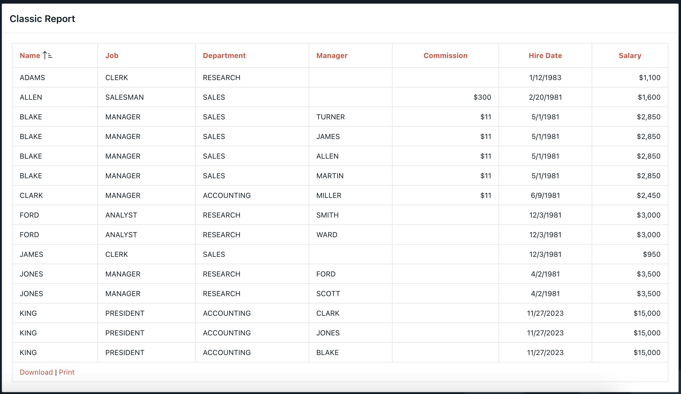
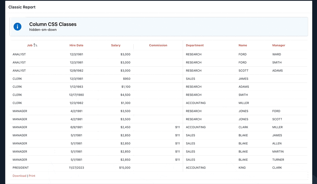
Classic Report - is displayed well on desktop, but on mobile, the problem is a big horizontal scroll and it is not easy to read what is on the report, especially when there's a column with large text.
Screenshot of the CR on the desktop. Columns are displayed as they should, and it looks nice.
Below is the same report displayed on the mobile.
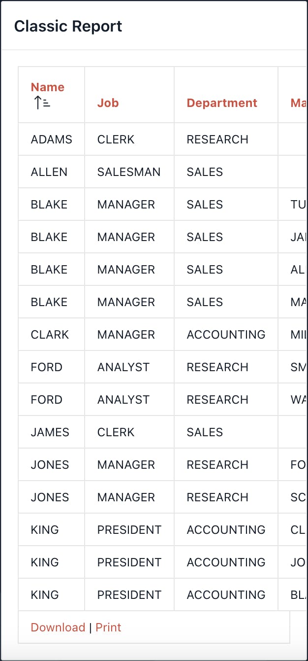
As you can see from the screenshot above, only three columns are displayed, and the user needs to scroll horizontally to see the rest, if there is a column such as a description it might be even worse.
Solution
Universal Theme provides CSS classes that we can use to display or hide elements depending on the screen width.
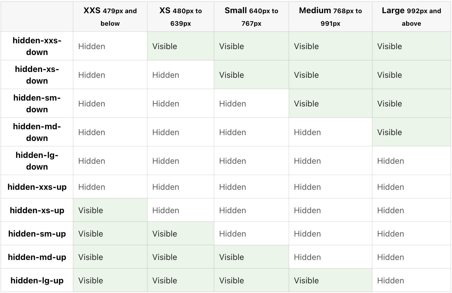
So take a look at the screenshot above, for instance the class hidden-sm-down means that the component will be hidden on the screen width of 767px and below, but will be displayed on any screen wider than 767px.
Let's hide Classic Report on the smaller screens and display Reflow Report instead.
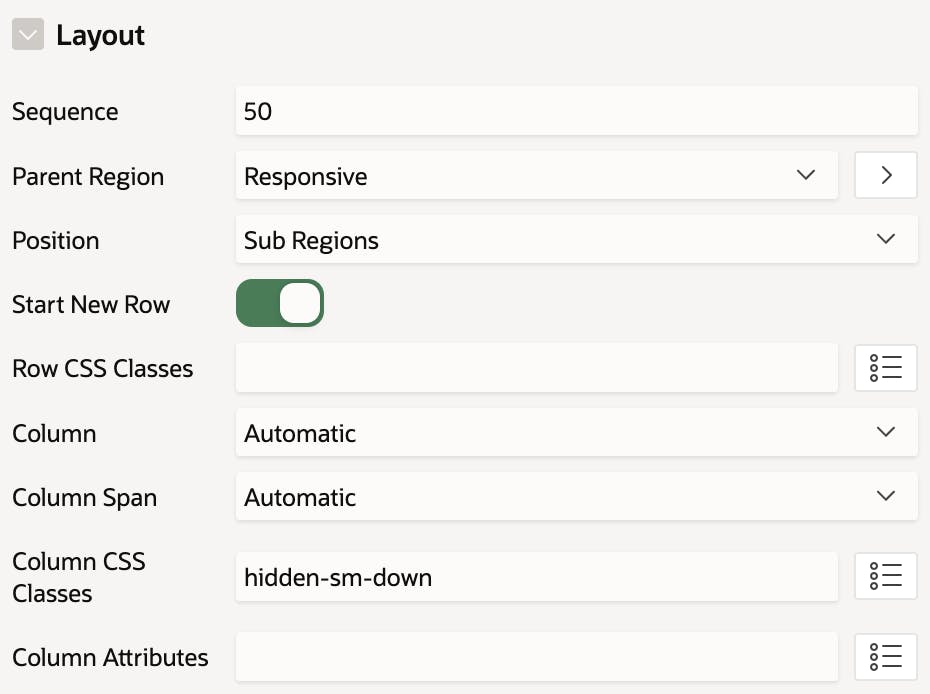
First, we need to create a Classic Report and assign the class hidden-sm-down to the CR, which means that it will be hidden on the screen size below 767px.
Next, we need another report to be displayed on the screen size below 767px and hidden on the screen size above 767px. So create the Reflow Report and assign hidden-sm-up class, which is the opposite of hidden-sm-down.
Results
Here is the result where you can see how the report is changing depending on the screen size. Take a look at the classes at the top of the CR/Reflow Report.
Conclusion
Visibility Classes is the feature you will like if you are developing mobile applications with Oracle APEX. For more details about the Visbility Classes check the Universal Theme app.