In this blog post, we will explore the Responsive Classes of Universal Theme, marking the beginning of the UT series. These helper classes are available from Universal Theme 1.2, they are designed to help you to improve the responsive experience in your applications.
Grid Layout
Grid Layout is a system of 12 columns used to arrange APEX components on the screen. Understanding the system will help you understand the responsive classes and their behaviour.
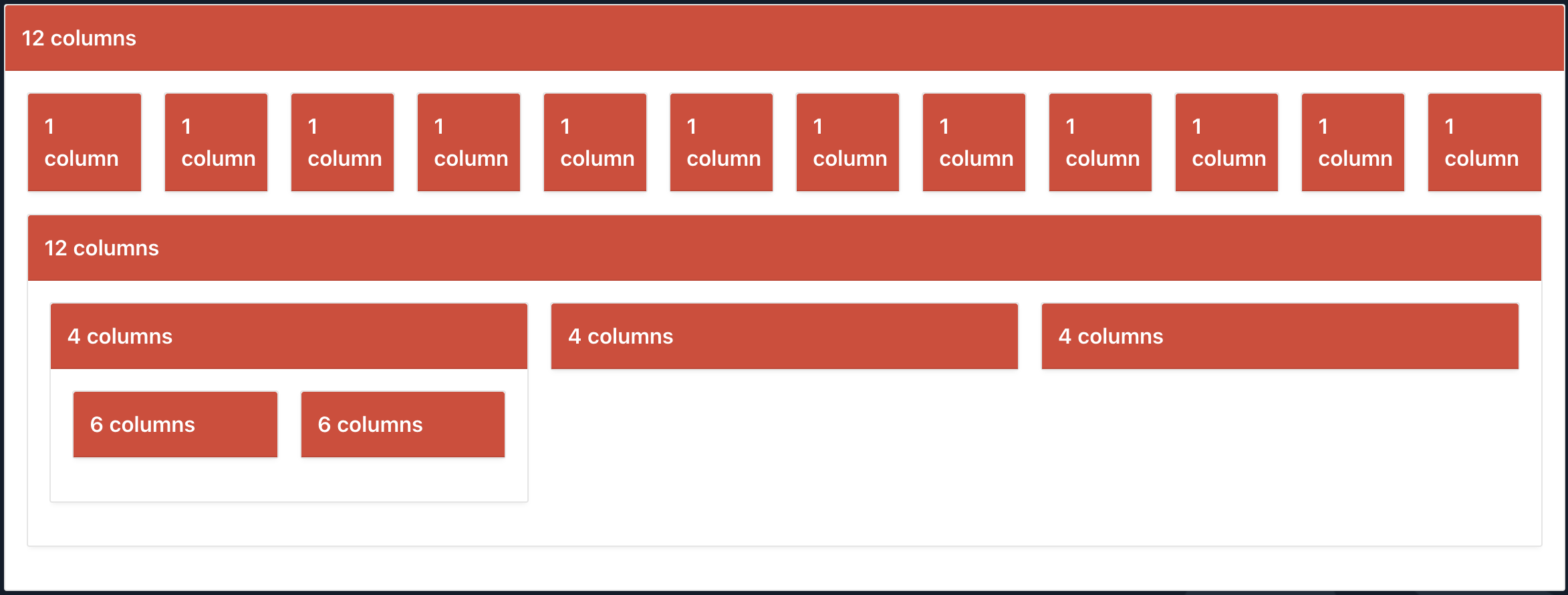
Based on the screenshot above we can conclude, that we have a parent region with a span of 12 columns, with 12 regions with a span of 1 column, and 1 region with a span of 12 again, etc. so you can see that every region has assigned span, and the same region can assign the span to child components, which is additional 12 columns. On the smaller screens region are splited which makes them responsive.
Responsive Classes
Let's say you have three chart regions in one row, all of them have a span of 4 columns (image below).
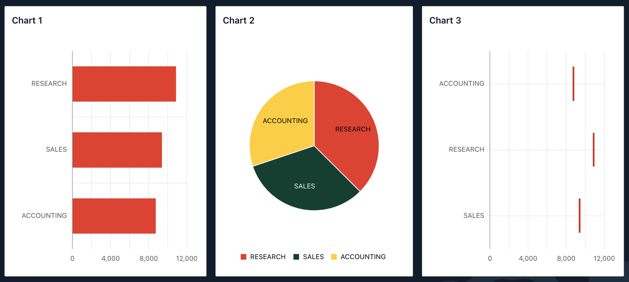
When you are on the phone they are splitted one below another which is great. But the problem comes when you are on a bit bigger screen, such as a tablet, they might be not splitted and make the user experience very bad.
Below is the same charts but, in the responsive mode, so you can see the behaviour on the different screen size.
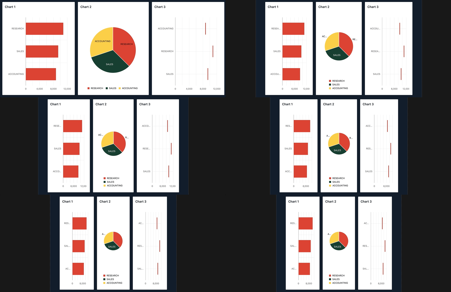
So, as you can notice charts are not splitted and not user-friendly. This is the case when we need help from responsive classes, to get full control on spitting the regions to a new row.
| All | XX Small | X Small | Small | Medium | Large | X Large | XX Large | |
| Range | All | 479px and below | 480px to 639px | 640px to 767px | 768px to 991px | 992px to 1199px | 1200px to 1399px | 1400px and above |
| CSS Class Prefix | .col- | .col-xxs- | .col-xs- | .col-sm- | .col-md- | .col-lg- | .col-xl- | .col-xxl- |
| Number of Columns | 12 | |||||||
| Gutter | 1rem (0.5rem each side) |
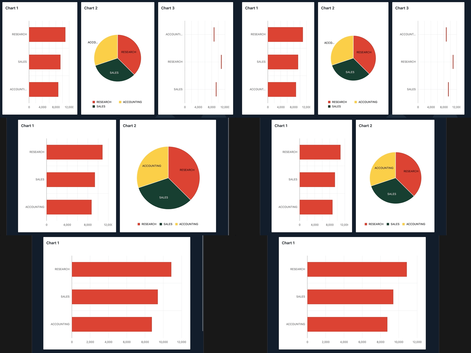
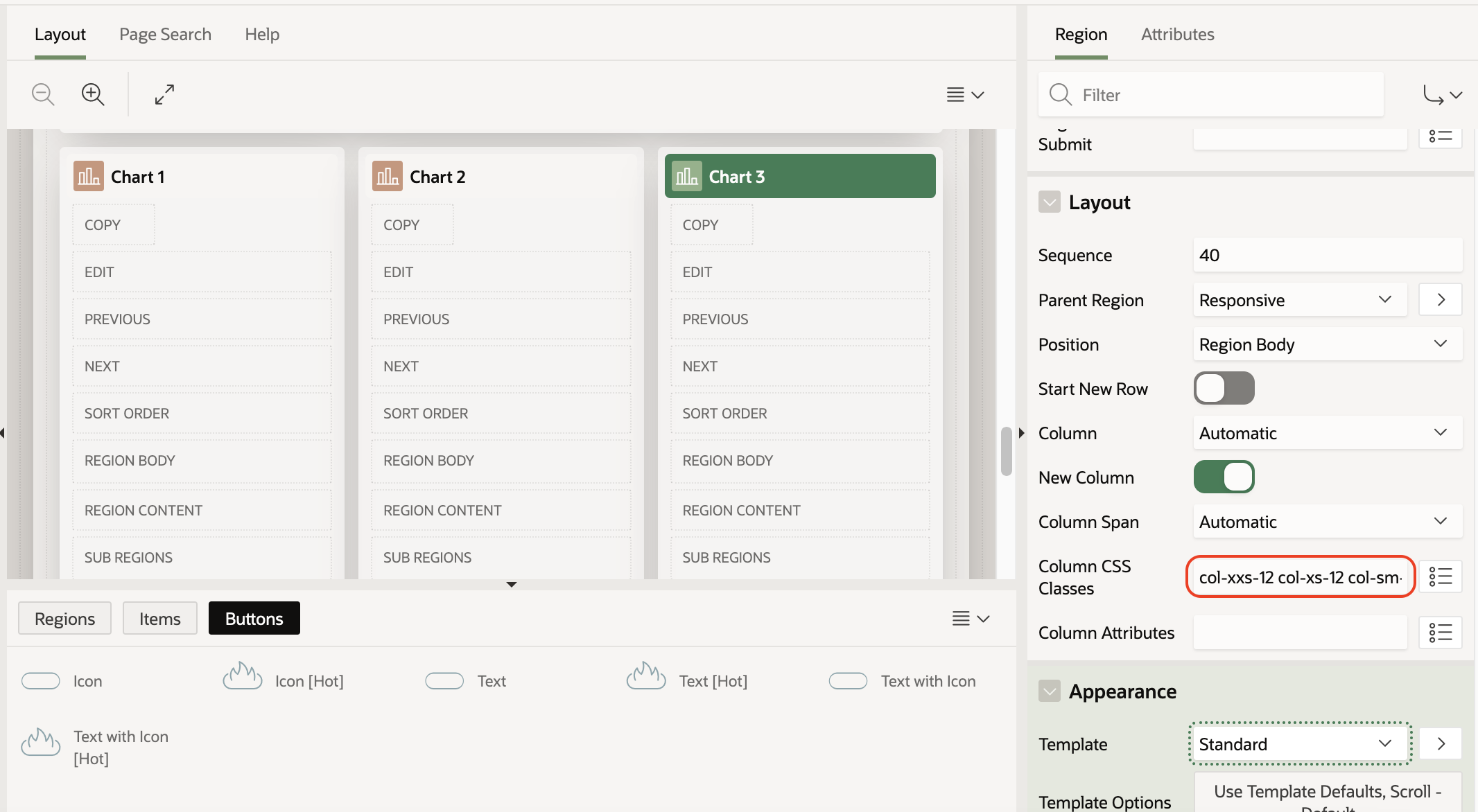
The table above explains the range and provide class prefix that you can use, so, for instance, to split regions on smaller screens you can use this combination of classes - col-xxs-12 col-xs-12 col-sm-12 col-md-6 col-lg-4 These classes will split regions to new rows on smaller screens. On the medium screen, the region will be half of the screen, and on a big one, it will be a third of the screen. 12, 6, and 4 are the numbers of columns(span in the Grid Layout) you want to have on that component when the screen is in a certain range.
Result after adding the column classes to charts. Charts are splitted one below another.
A place to add the classes is the region > Column CSS Classes as shown in the image below.
Conclusion
Incorporating responsive classes into your design improves the user experience, but also eliminates the need for custom coding, which potentially can produce problems on application/theme upgrades.

