While seeking ways to improve our Oracle APEX Component Designer, I discovered some useful features in the Interactive Grid documentation. I’ll give you a quick rundown in this blog, and you can look forward to seeing them soon in our APEX Component Designer tool.
Options
- reorderColumns
It can be annoying for users if they accidentally change the order of a column in the IG. By default, users can click on the left edge of a column and move it to a different spot in the IG. To prevent this, we have a "reorderColumns" option. The default is set to true meaning users can move columns around. But if you want to disable that option, you can set it to false.
Behaviour when reorderColumns is enabled.
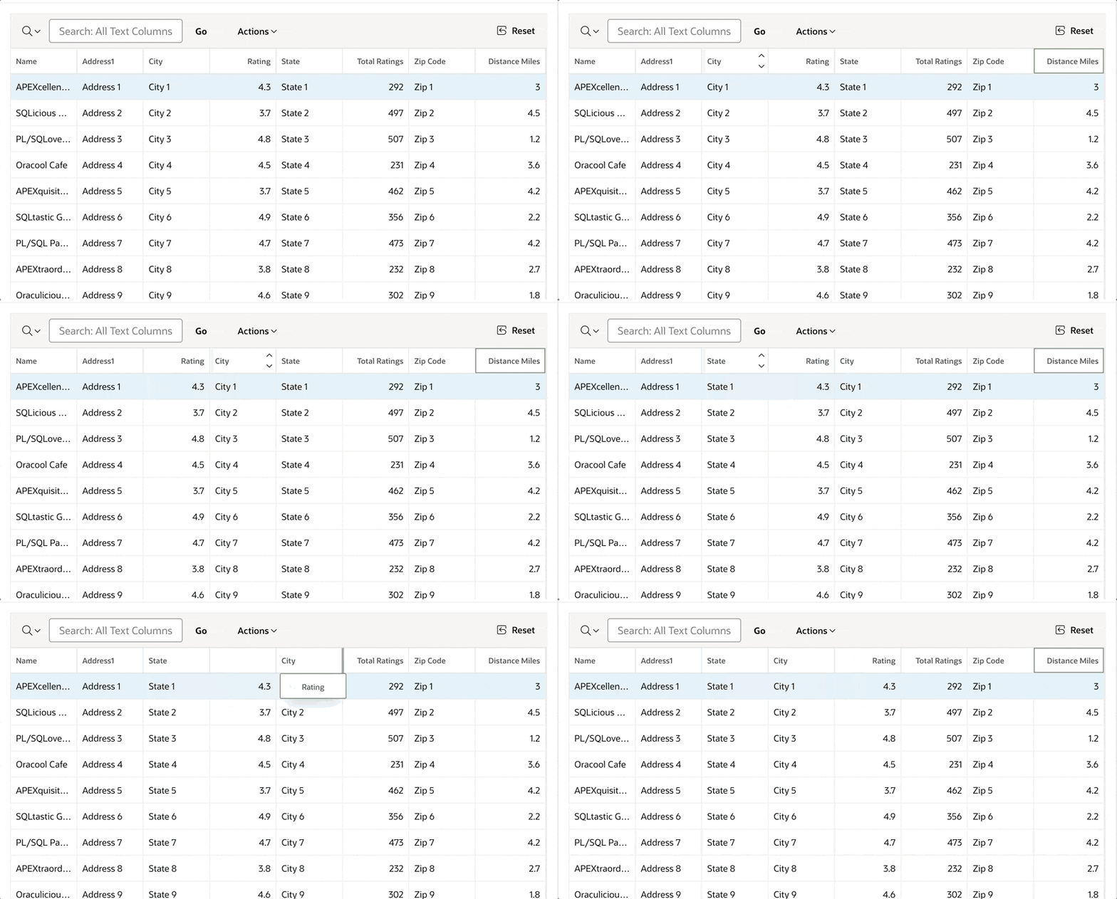
After setting reorderColumns to false, the option is disabled, so the user is not able to reorder the columns.
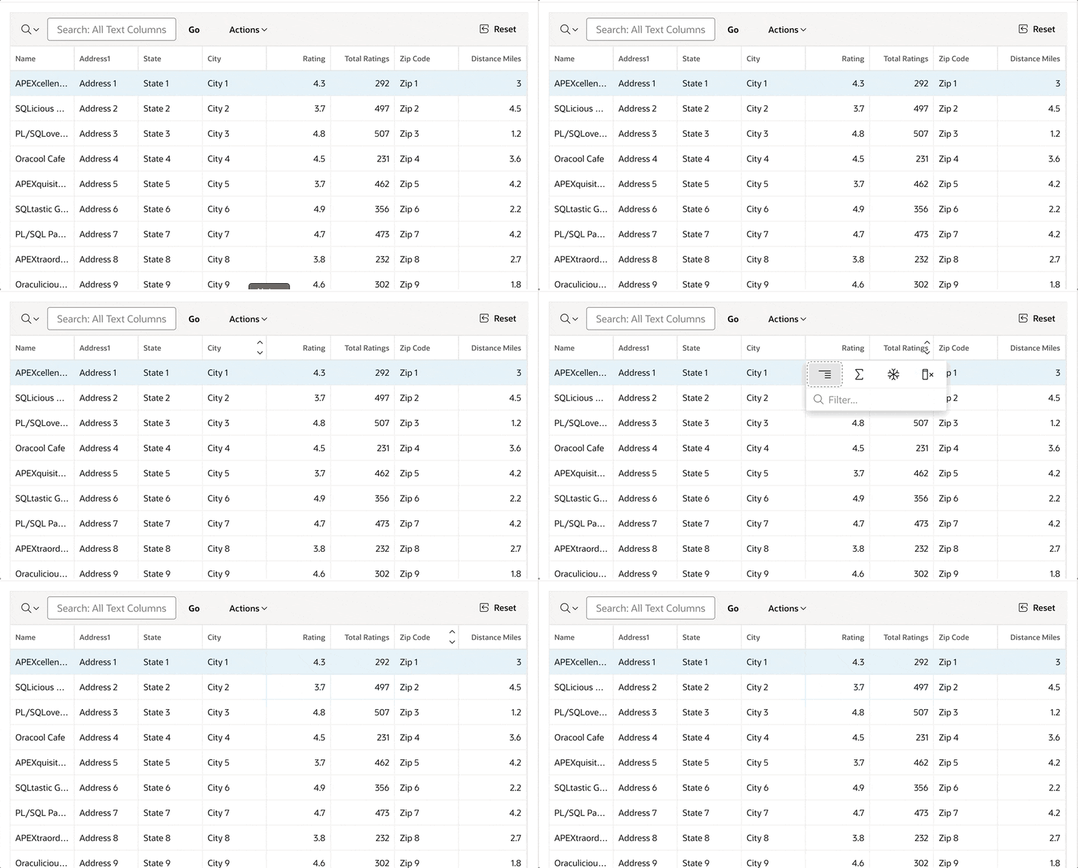
The code for reorderColumn option.
function(options) {

    options.defaultGridViewOptions = {
       reorderColumns: false
}

 return options;
}
- skipReadonlyCells
When users edit the IG, they use the tab key to move between columns. If you have columns that can't be edited (read-only), the tab key still goes there. To avoid this and skip read-only cells, you can set the "skipReadonlyCells" option to true. The default setting is false.
The behaviour after setting skipReadonlyCells to true.
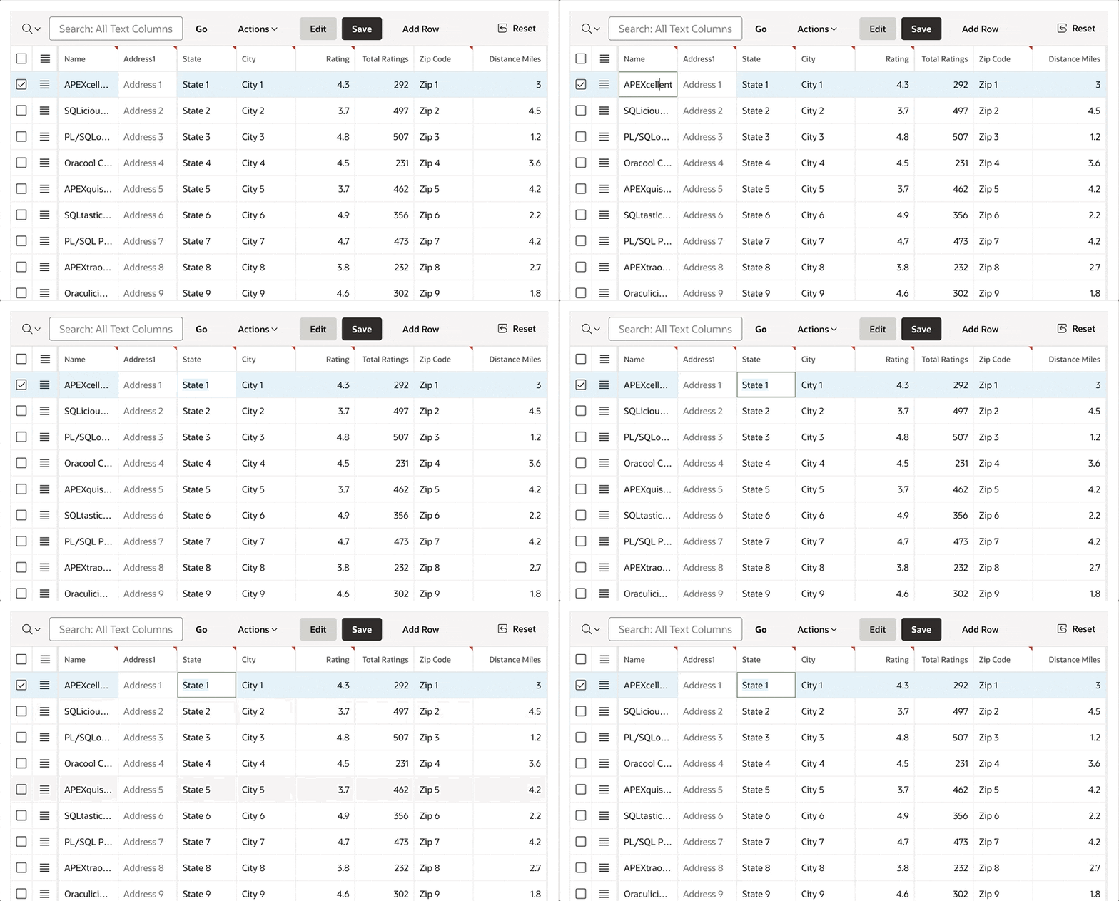
The code for skipReadonlyCells option.
function(options) {

    options.defaultGridViewOptions = {
       skipReadonlyCells: true
}

 return options;
}
- footer
If you don't want to show the footer of the IG, perhaps because there are only a few rows to display, you can use the footer option. Set it to false to hide the footer. The default setting is true.
The look after disabling the footer.
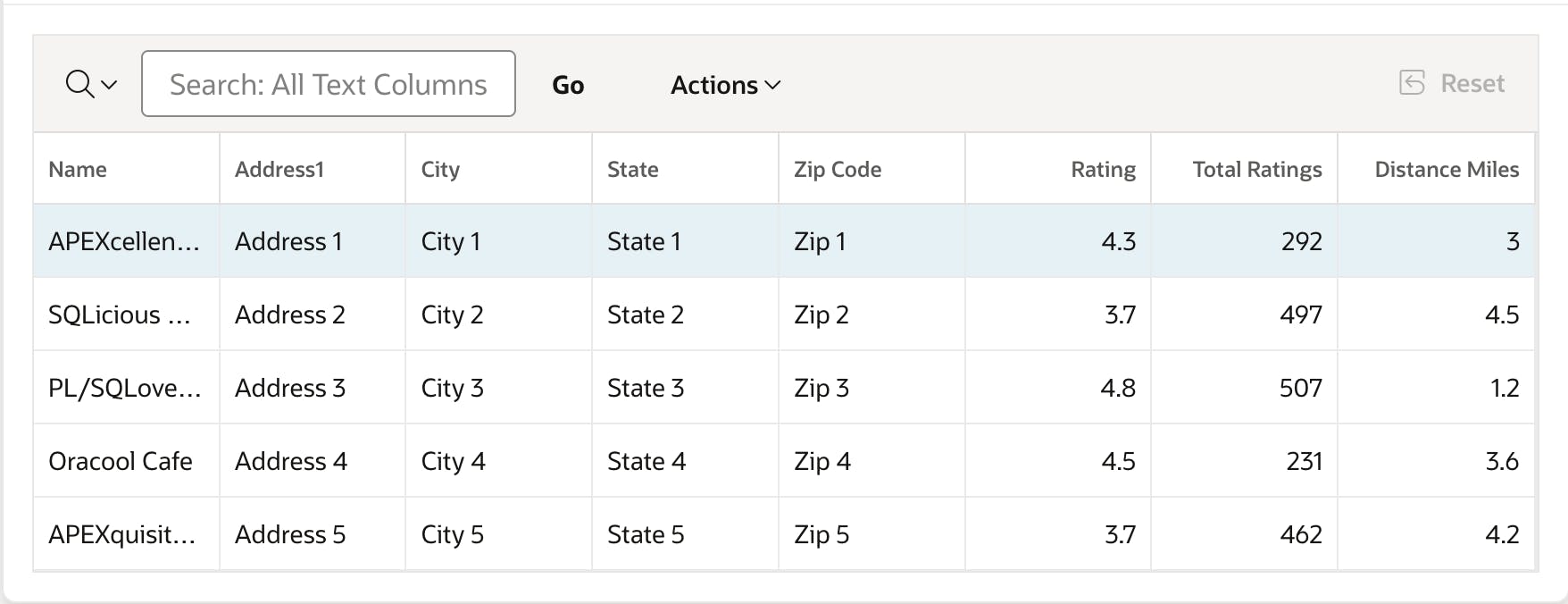
The code for the footer option.
function(options) {

    options.defaultGridViewOptions = {
       footer: false
}

 return options;
}
- hideEmptyFooter
In case you want to display the footer, but not when no data found message is shown. The option hideEmptyFooter is available to hide the footer.
The behaviour of the hideEmptyFooter option.
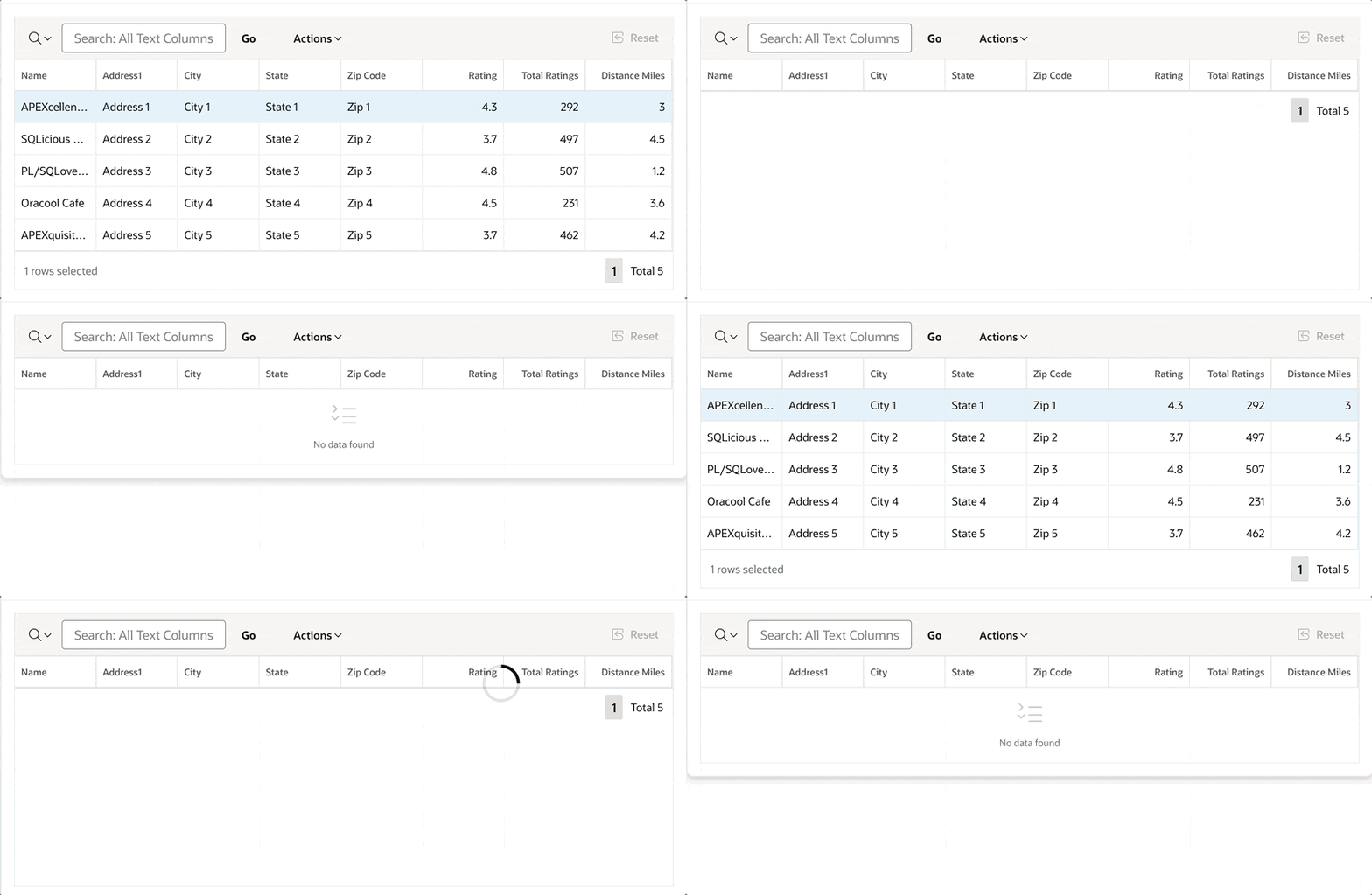
The code for the hideEmptyFooter option.
function(options) {

    options.defaultGridViewOptions = {
       hideEmptyFooter: true
}

 return options;
}
- noDataIcon
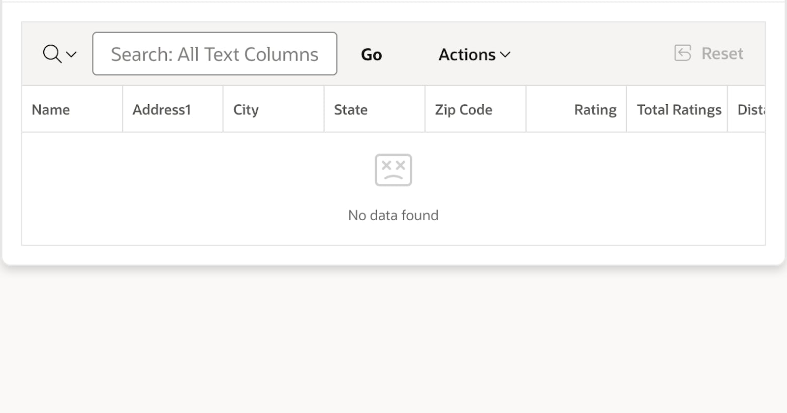
If you want to change the icon displayed when there's no data found in the IG, you can use the noDataIcon option and provide the icon name as the value.
Look at the new icon, when no data is found.

The code for the noDataIcon option.
function(options) {

    options.defaultGridViewOptions = {
       noDataIcon: "fa fa-404"
}

 return options;
}
- hideDeletedRows
Another interesting option is hideDeletedRows. When you delete a row in the IG, the row is typically still visible until you click the Save button. However, if there's a reason to hide it immediately, this option is supported.
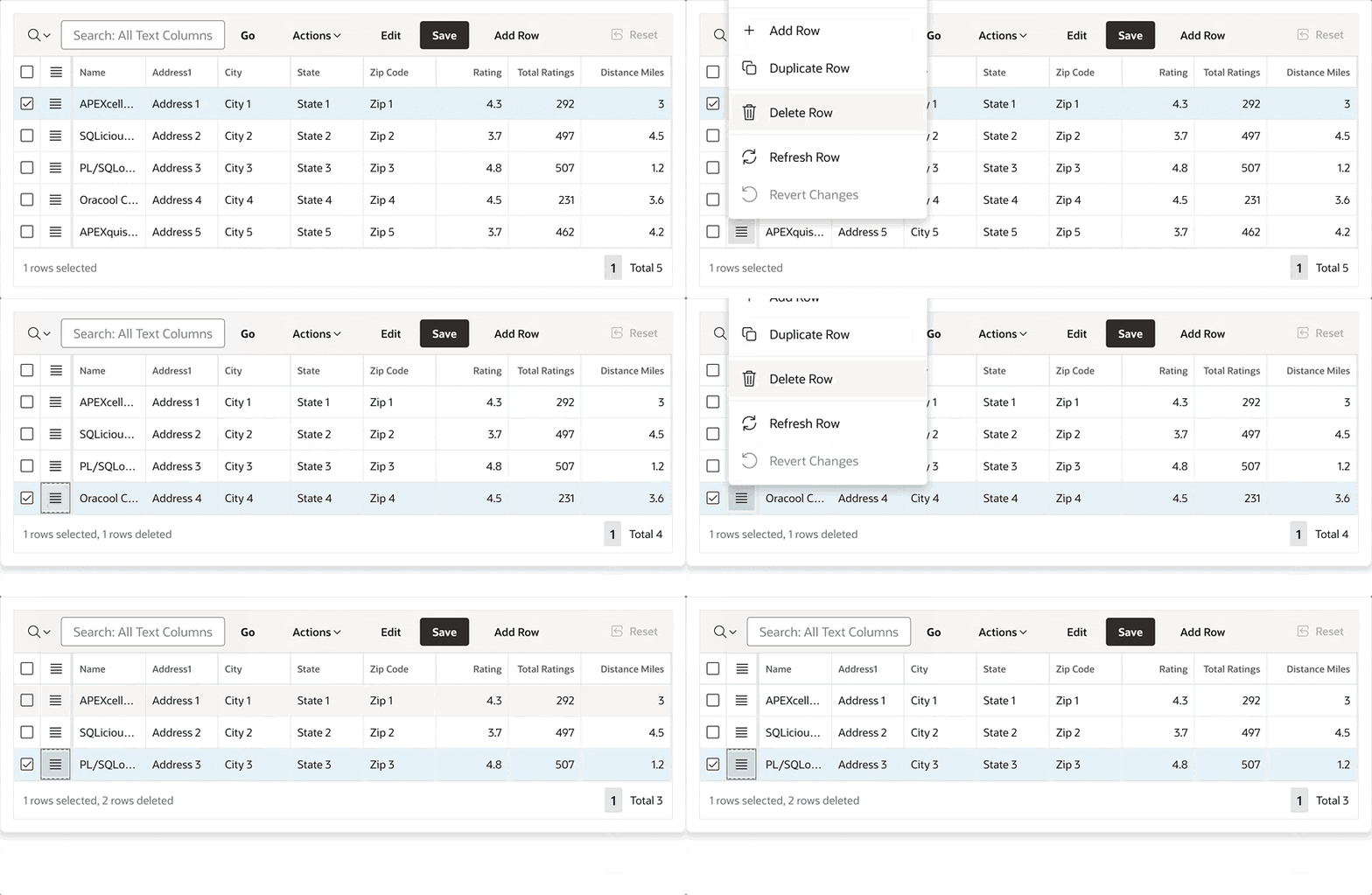
The code for the hideDeletedRows option.
function(options) {

    options.defaultGridViewOptions = {
       hideDeletedRows: true

 return options;
}
- pagination
To have more control over your pagination, you can utilize the pagination option.
The configuration shown in the image below removes links and buttons, resulting in the footer displaying only the count and the number of selected rows.
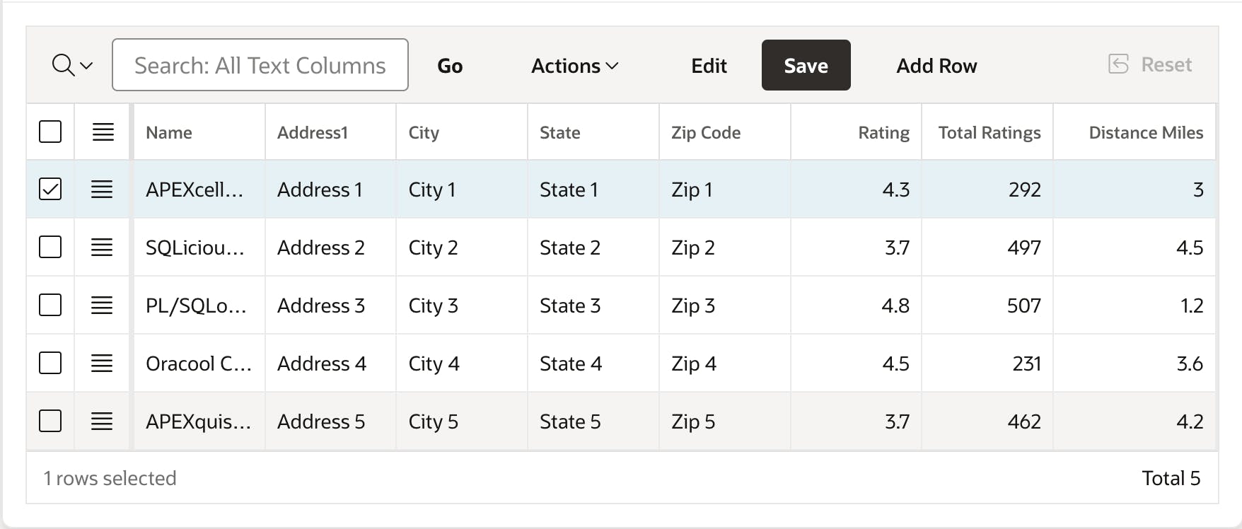
The code for the pagination option.
function(options) {

    options.defaultGridViewOptions = {
       pagination: {
        showRange: true,
        showPageLinks: false,
        maxLinks: 0,
        firstAndLastButtons: false
      }
}

 return options;
}
To discover more details about the options mentioned above, refer to the official documentation - docs.
Code Example for all the options
function(options) {

    options.defaultGridViewOptions = {
       reorderColumns: false,
       skipReadonlyCells: true,
       footer: true,
       hideEmptyFooter: true,
       noDataIcon: "fa-database-search",
       hideDeletedRows: true,
       pagination: {
        showRange: true,
        showPageLinks: false,
        maxLinks: 0,
        firstAndLastButtons: false
      }
}

 return options;
}
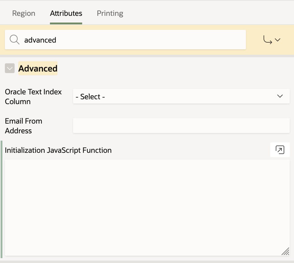
The code above should be added to the JavaScript Initialization Function, which is located under the Advanced section in region attributes.
Conclusion
I hope you find these options useful. They will be integrated into the Component Designer tool. Until then, feel free to write code manually. ;)
Check out the Component Designer tool, there are already components and their options, that might be useful in your development.
